Page 1 of 1
Ape Escape: Please Rate

Posted:
Sat Jun 19, 2010 8:05 pmby crait
1 >
2 >
3 >
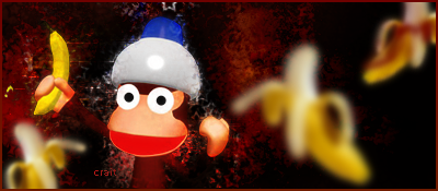
Didn't follow any tutorials for this one.

I wanted to get a good feel of depth and work on another style than I usually do. Please rate and tell me which is best!

I'm really wanting some criticism on these! Thanks!
Posted:
Sat Jun 19, 2010 8:14 pmby que13x
The top image seems to have more detail but is darker.
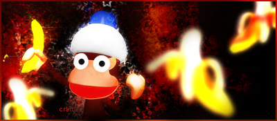
The middle image looks good but has less detail.
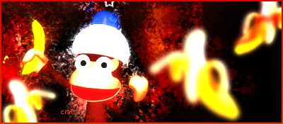
The bottom pic is washed out. It's no good.
Posted:
Sat Jun 19, 2010 8:20 pmby crait
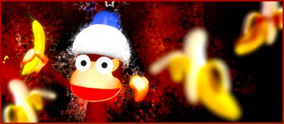
Okay, played with the levels, contrast, saturation....
One >
New >
Two >
Posted:
Sat Jun 19, 2010 8:23 pmby que13x
How come I can't see the light shining on the helmet on the bottom too like I can on the top one?
Keep the top one. It isn't as bright but has more detail and that is always a good thing.
Posted:
Sat Jun 19, 2010 8:26 pmby crait
Because I made the overall color of the helmet color closer to white. The glare's color and the helmet color are soo close, you can't see the difference with your naked eye.
Posted:
Sat Jun 19, 2010 10:02 pmby Mailas
The blur effect really doesn't go with the entire image.
Your smudge looks good though. Lighting could use a bit of work.
Also try using a different font.
I'm giving it 7/10

Posted:
Sat Jun 19, 2010 10:12 pmby crait
Thanks Que and Mailas for the criticism.
Posted:
Sun Jun 20, 2010 1:25 pmby .Yunoko
I will C&C later. Glad you liked the render I found for you good enough
Posted:
Sun Jun 20, 2010 1:31 pmby Puncharger
I don't know.
I liked the third one.
Posted:
Sun Jun 20, 2010 1:56 pmby airplanes18
id say on the new post.... top ones the best.
Posted:
Mon Jun 21, 2010 11:26 amby The Cookie Monster
airplanes18 wrote:id say on the new post.... top ones the best.
I agree! and ape escape was a pretty good game!